find out more
Unlock 50% off our website design package to flourish online!
limited time offer: save big, grow bigger
Entrepreneur
Business tips
Marketing tips
Startups
5 secrets to writing website copy that sells
Lessons I learnt in my first year of being an entrepreneur
Serve your audience with an interactive quiz
All
Entrepreneur
Wellness
Design
View all
My latest tips, tricks and advice on running an online business to live your best life!
Design
Hoxton & Co. –
Brand Reveal
How to create the perfect colour palette for your brand
How to add your Instagram grid to Showit
All
Entrepreneur
Wellness
Design
The know how's of designing a successful brand and an effective website for your biz
branding tips
website tips
portfolio
View all
tutorials
Wellness
Get more done & stop procrastinating with calendar blocking
How to listen to your intuition when making big decisions
How to stay organised and boost productivity as a business owner
All
Entrepreneur
Wellness
Design
Being a powerful entrepreneur and owning a successful business starts with you!
mindset
personal growth
productivity
View all
hey!
i'm ashlea
I'm here to support and encourage you on your own entrepreneurial journey and to help you live a life of freedom.
meet ashlea
let's connect
Entrepreneur
tips for the
categories
Designer
tips for the
Wellness Queen
tips for the
get your freebies!
Subscribe
BLOOM MAIL
For the fearless woman who's building her empire! Join now.
Alex from Medley Dance came to me enquiring about branding back in July 2018. Once I heard about the brand’s mission I knew I wanted to be a part of it.
“Medley Dance is a dance company that offers workshops for children and young adults with all different abilities. Their aim is to be inclusive and provide an opportunity for all abilities to come together through the art of dance.”
Alex told me all about her dancing and teaching experience and I was super excited to create a brand that did this amazing startup company justice!
FIRST OF ALL, LET’S TALK ABOUT THE INSPIRATION
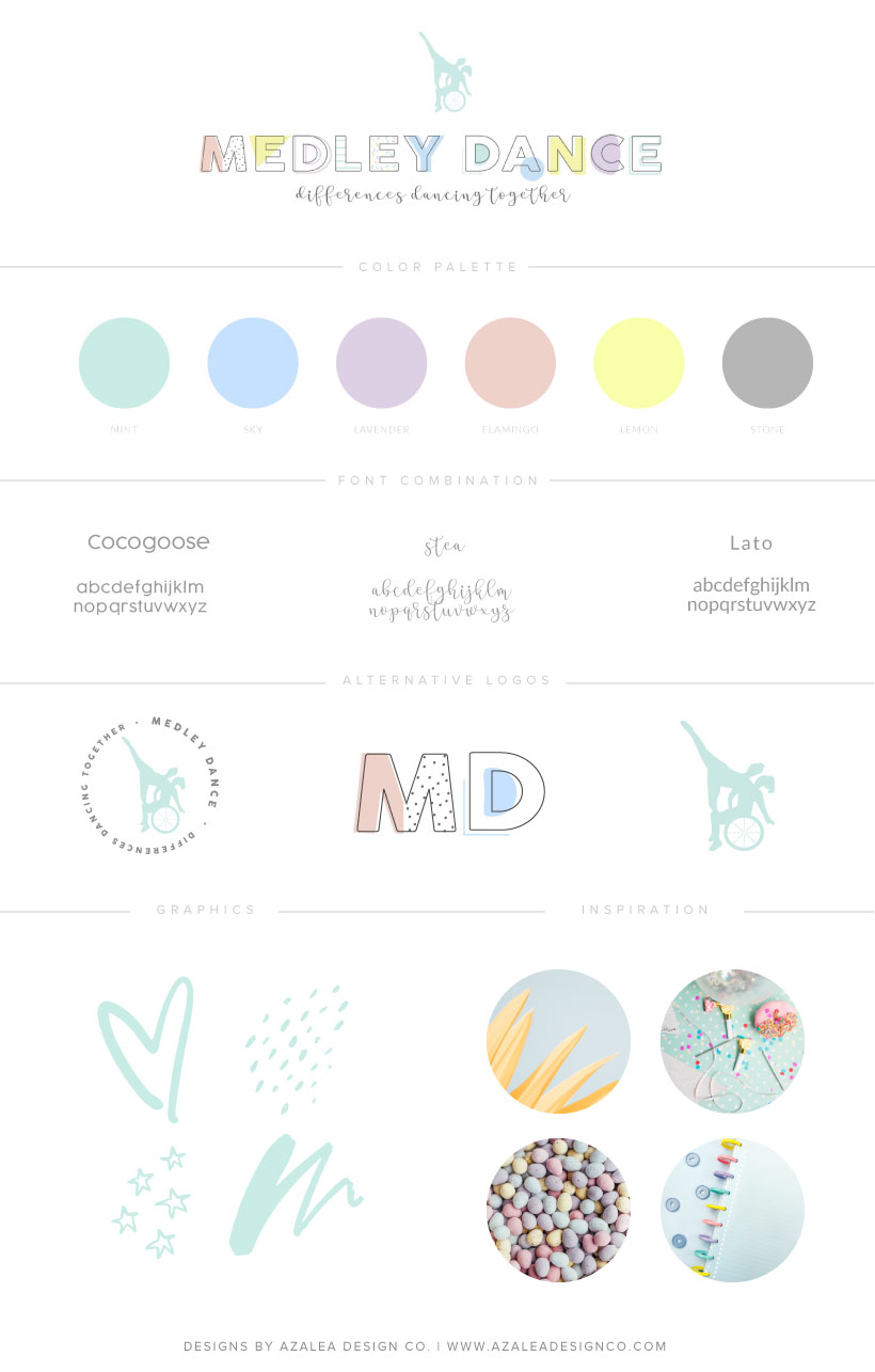
Alex mentioned that she would prefer the brand colours being colours in the rainbow. To her, this represented her mission of inclusion and differences.
Seeing as the brand is primarily aimed at children and young adults, I suggested that we take a pastel route instead of bright colours.
The image below sparked inspiration for the brand.
Let’s get on with the brand reveal!
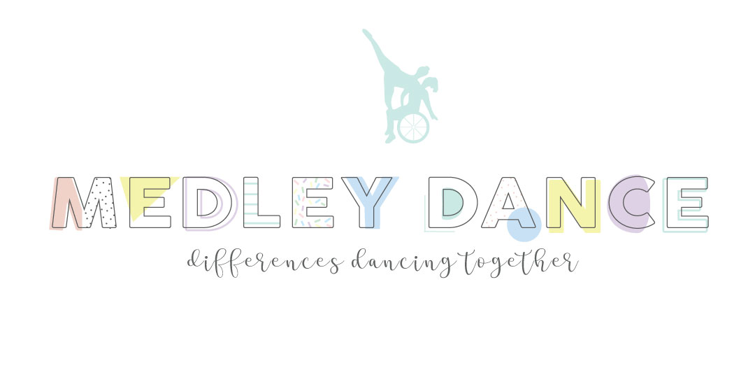
Primary Logo
Alex already had an image for her logo, which was brilliant! She sent through an image of a dance routine in practice which included a wheelchair and I thought it was the perfect graphic to symbolise her brand. So I created the graphic and we used it in her branding.
For the main text ‘Medley Dance’ I wanted it to attract to her target audience and be fun but also adhere to the brand mission of difference. As you can see, we happily agreed upon this.
I honestly love this for so many reasons. Not only is it fun and quirky but I feel as though the letters symbolise people. The simple outline symbolises that people are all the same but the accents on top represent our differences and uniqueness.
For the subtext, I thought should contrast the main text and also reflected a child’s handwriting. (Obviously, a lot neater)
Alternative Logo
Favicon
Submark
Colour Palette
Font Combination
Branding Style Guide
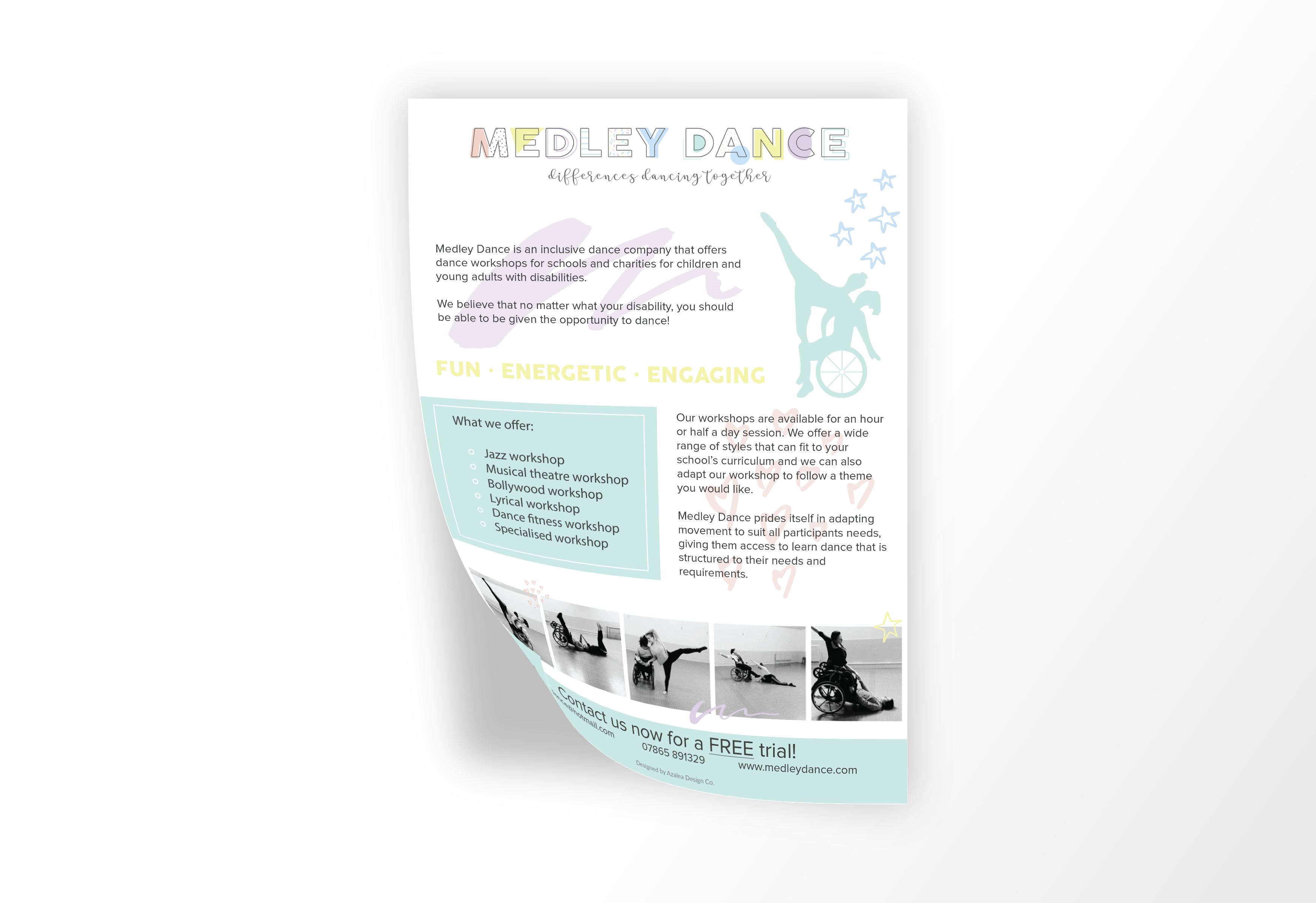
Leaflet Design
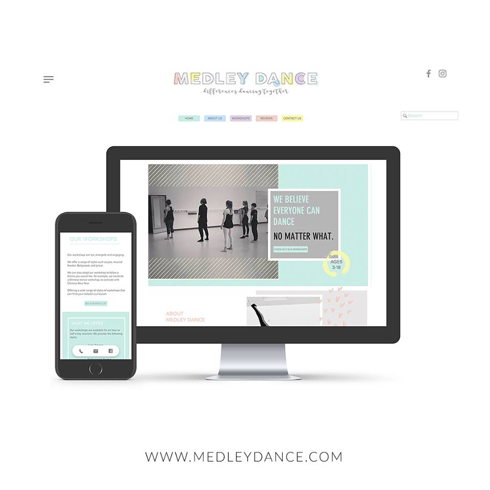
Website Design

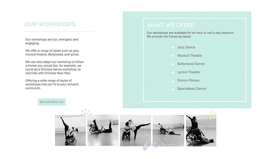
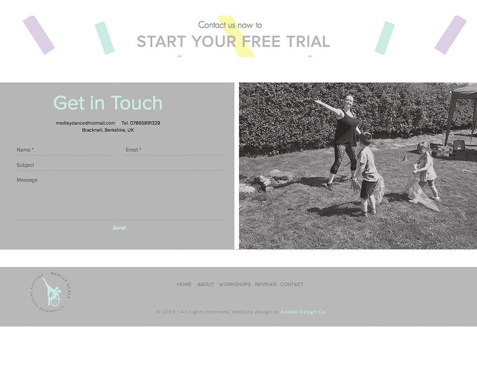 Click here to view the full website
Working with Alex has been a dream and I am so honoured to get to be a part of her startup business. We wish her all the best with her new business.
Alex’s words:
“AMAZING! Azalea Design Co. helped me turn my dreams of how my company would look in to a reality. From the start there was fast and quick responses and clear instructions on how to get my thoughts across, with fast results to follow. For me who isn’t very good with technology Ashlea went through everything with me to understand how to use my website and logo to the max. All her work was beautifully executed! Thank you so much I love my logo, website and leaflet design, and will definitely use you again!”
– Alex | Owner & Dance Teacher of Medley Dance
www.medleydance.com
Let us know in the comments what you think about Medley Dance’s new brand & website reveal!
You’ll also love…
Leave a ReplyCancel reply
5 secrets to writing website copy that sells
Our top picks
entrepreneur
Get more done & stop procrastinating with calendar blocking
Wellness
Azalea Design Co. – Brand & Website Reveal
design
Lessons I learnt in my first year of being an entrepreneur
The biggest logo design mistake you can’t afford to make
design
MORE
entrepreneur
Dreaming of starting a business? Follow these 5 action steps
Our top picks
entrepreneur
How to stay organised & boost productivity as a business owner
Wellness
Why I chose to move to Showit
design
5 steps to finding your business niche & defining your ideal client
How to prevent & overcome mental burnout as a creative entrepreneur
WELLNESS
BACK
entrepreneur
Join our bloom mail!
Weekly inspiration, resources and support for the fearless woman who's building her empire!
subscribe
let's be insta friends!
© Azalea Design Co. 2024 | All rights reserved | Handcrafted with love and created with Showit
Serving worldwide
I'm Ashlea and I'm super passionate about helping ambitious women, like you, ditch the 'standard 9-5' to create a life and business of their dreams.
Located in London, UK
