find out more
Unlock 50% off our website design package to flourish online!
limited time offer: save big, grow bigger
Entrepreneur
Business tips
Marketing tips
Startups
5 secrets to writing website copy that sells
Lessons I learnt in my first year of being an entrepreneur
Serve your audience with an interactive quiz
All
Entrepreneur
Wellness
Design
View all
My latest tips, tricks and advice on running an online business to live your best life!
Design
Hoxton & Co. –
Brand Reveal
How to create the perfect colour palette for your brand
How to add your Instagram grid to Showit
All
Entrepreneur
Wellness
Design
The know how's of designing a successful brand and an effective website for your biz
branding tips
website tips
portfolio
View all
tutorials
Wellness
Get more done & stop procrastinating with calendar blocking
How to listen to your intuition when making big decisions
How to stay organised and boost productivity as a business owner
All
Entrepreneur
Wellness
Design
Being a powerful entrepreneur and owning a successful business starts with you!
mindset
personal growth
productivity
View all
hey!
i'm ashlea
I'm here to support and encourage you on your own entrepreneurial journey and to help you live a life of freedom.
meet ashlea
let's connect
Entrepreneur
tips for the
categories
Designer
tips for the
Wellness Queen
tips for the
get your freebies!
Subscribe
BLOOM MAIL
For the fearless woman who's building her empire! Join now.
I have seen this time and time again with logo design enquiries where:
a) the client only wants a logo
b) they want to include every idea in that logo
Take a minute to quickly name three popular brands. Now visualise their logo design.
Chances are you picked a brand with a one word name and a simplistic logo.
How to identify if you are making this mistake:
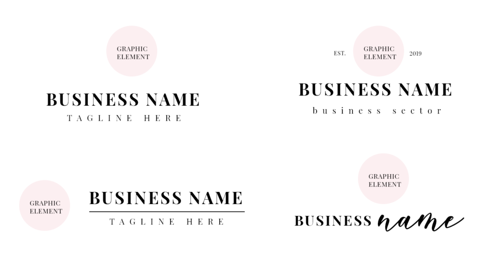
1. Your logo has no graphic element
(Nike have the swoosh, Apple has the apple with a bite taken out of it and Amazon has the orange arrow.)
2. Your logo has more than one graphic element
The main reason for having a graphic element in your logo is simply because it is easier for people to identify a graphic with a business and it is something you can use throughout your content & marketing.
(Have a look at other brands and let me know if they are using more than one graphic element in their primary logo.)
3. Your logo has too much text
Once again, I can reiterate that people are attracted to visuals rather than text and the most memorable logos are simplistic and dont use too many words.
4. The text is the same format
Having one text format for all of the words in your logo, will make it less appealing and engaging. By text format, I mean font, size and colour. This suggests that text is one (paragraph) even if you include your company name & business sector.
5. The text is unclear and unreadable
This is an obvious one. I understand the need to come up with creative ideas for your logo, like trying to incorporate graphics and text together, but at the end of the day if it is not executed well, then it’s probably going to look like a hot mess. People won’t take the time to try and work out what the text says and what your business name is. This is a total no no. (Example: 2012 London Olympics logo – 2012 is so unclear)
6. When you condense your logo, all the elements are not clearly visible
Your logo will be used on many platforms and media and in any size. So when you reduce your logo size, let’s say for your Facebook profile, is all of the text and graphics clearly visible? If not, then either the quality is bad, or your logo is too crowded and busy.
Tips for designing an effective logo:
1. Choose one graphic element
This could be something super simple or an artistic masterpiece.
It may be useful to do some logo research to gather some ideas. Just ensure to use a graphic element that has relevance to your brand. Amazon’s graphic element is the arrow, but it is strategically placed from A-Z which suggests that you can buy and search for any product under A-Z.
2. Use readable fonts
It may seem like an obvious point, but I have seen some logos where I can’t decipher what their business name is. The best fonts to use is either a Serif or Serif Sans font. Calligraphy/Handwriting can be used effectively if is largely sized or has a high kerning (spacing between letters)
3. Change text formats
If you have more than one piece of text, please make sure that the font, size and colour is different. It will look a lot more inviting and will show that there are two parts of text to read. Also, this helps the viewer to decipher which is your business name (as this will be larger and bolder) and any additional info they need to know.
4. Ideally stick with two colours
Okay, so I have designed a logo that had more than two colours, and one works reaalllyyy well. However, this can look quite chaotic and inconsistent, so as a rule of thumb I would advise just to stick with two colours throughout your primary logo.
If you have a lot of colours that you want to include in your brand, simply just divide them between your logo variations and branding. #problemsolved
Read my blog post if you want to know more about branding & logo variations.
5. Choose the best format
If we are talking about visually pleasing aesthetics and psychology on how the brain intakes information, the best way to display your logo is portrait as opposed to landscape (also this is more adaptable for social media profiles)

6. Anything else you wanted to use in your logo, use for your branding.
The most important tip – don’t try and squeeze every element of your brand into one logo. Simply implement all of your elements (colours, fonts, text) throughout your brand. This can be used for your website, social media content and marketing materials.
attract clients, branding, branding tips, business, business tips, design tips, logo design, logo tips
Ashlea Zietz
written by
Share this post:
Leave a ReplyCancel reply
5 secrets to writing website copy that sells
Our top picks
entrepreneur
Get more done & stop procrastinating with calendar blocking
Wellness
Azalea Design Co. – Brand & Website Reveal
design
Lessons I learnt in my first year of being an entrepreneur
The biggest logo design mistake you can’t afford to make
design
MORE
entrepreneur
Dreaming of starting a business? Follow these 5 action steps
Our top picks
entrepreneur
How to stay organised & boost productivity as a business owner
Wellness
Why I chose to move to Showit
design
5 steps to finding your business niche & defining your ideal client
How to prevent & overcome mental burnout as a creative entrepreneur
WELLNESS
BACK
entrepreneur
Join our bloom mail!
Weekly inspiration, resources and support for the fearless woman who's building her empire!
subscribe
let's be insta friends!
© Azalea Design Co. 2024 | All rights reserved | Handcrafted with love and created with Showit
Serving worldwide
I'm Ashlea and I'm super passionate about helping ambitious women, like you, ditch the 'standard 9-5' to create a life and business of their dreams.
Located in London, UK


