


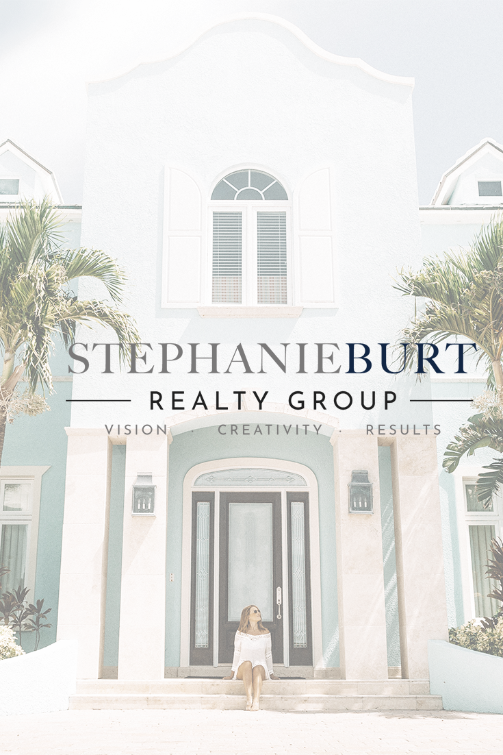
When I started this project, Stephanie already had a vision for her logo. She had a couple of ideas of what she was wanting but needed them it to be refined. So that’s what I did!
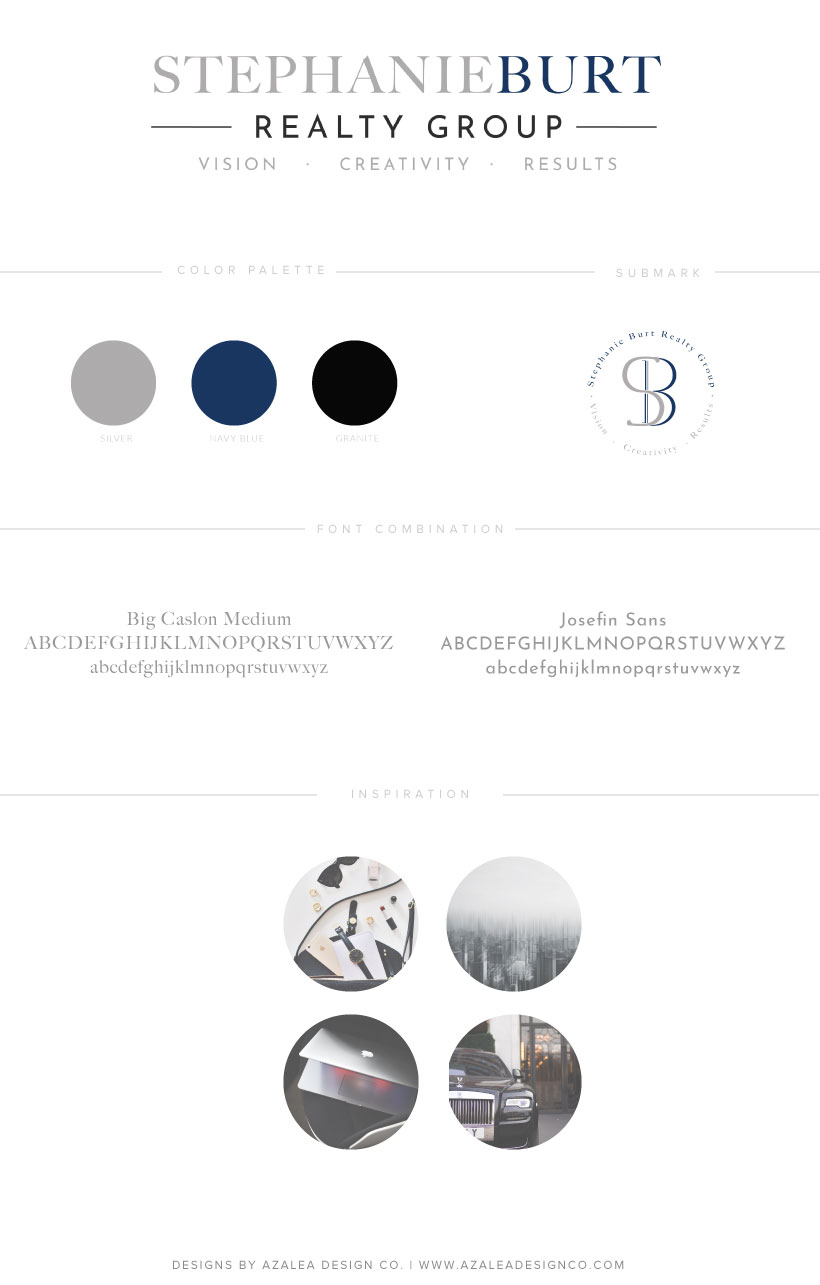
When speaking with Stephanie, she said she wanted to stick with her current colour palette of grey, navy and black. Her company is a luxury Realty Group in Atlanta, Georgia but also deals with lower end investment properties.
So the vision for the logo for her realty group was to be slightly luxurious, modern and simple. Stephanie was also really keen to have her three word tagline included.
Let’s get on with the brand reveal!
Primary Logo
![]()
Submark
![]()
Branding Style Board
I’d love to know your thoughts on Stephanie Burt Realty Group’s new logo & branding in the comments!

You’ll also love…
