find out more
Unlock 50% off our website design package to flourish online!
limited time offer: save big, grow bigger
Entrepreneur
Business tips
Marketing tips
Startups
5 secrets to writing website copy that sells
Lessons I learnt in my first year of being an entrepreneur
Serve your audience with an interactive quiz
All
Entrepreneur
Wellness
Design
View all
My latest tips, tricks and advice on running an online business to live your best life!
Design
Hoxton & Co. –
Brand Reveal
How to create the perfect colour palette for your brand
How to add your Instagram grid to Showit
All
Entrepreneur
Wellness
Design
The know how's of designing a successful brand and an effective website for your biz
branding tips
website tips
portfolio
View all
tutorials
Wellness
Get more done & stop procrastinating with calendar blocking
How to listen to your intuition when making big decisions
How to stay organised and boost productivity as a business owner
All
Entrepreneur
Wellness
Design
Being a powerful entrepreneur and owning a successful business starts with you!
mindset
personal growth
productivity
View all
hey!
i'm ashlea
I'm here to support and encourage you on your own entrepreneurial journey and to help you live a life of freedom.
meet ashlea
let's connect
Entrepreneur
tips for the
categories
Designer
tips for the
Wellness Queen
tips for the
get your freebies!
Subscribe
BLOOM MAIL
For the fearless woman who's building her empire! Join now.
Our world is full of colour. Colour can evoke emotions and give you a customised experience. There may be certain colours you are more drawn to and pay attention to. I want to help you create a beautiful colour palette for your brand that you not only LOVE but that can strategically bloom your business.
When designing your brand, one of the first things you should consider is your colour palette. These colours that you choose will have a huge impact on your business – the people you attract, the vibe you set and the experience you give to customers.
According to statistics, “A ‘signature colour’ for your brand boosts brand recognition by 80%.”
Now let me say, that you don’t have to be an expert in art to know how to pair complimentary colours in a way that works for you. But there is a theory & strategy behind it, which is what I am sharing with you today.
So, if you are thinking that there are so many beautiful colours out there how can you narrow it down to a few? Then keep on reading. I’ll help you create the perfect colour palette for your brand, that you fall in love with!
When creating the perfect colour palette for your brand, you need to consider the following:
Which words describe your brand’s personality?
If you brand was a person, how would you describe them? Would they be Ambitious, Caring, Dependable, Edgy, Empowering, Entertaining, Feminine, Funny, Helpful, Inspirational, Luxurious, Quirky, Sassy, Smart, Spiritual, Whimsical etc.
How do you want your audience to feel?
When your customers come into contact with your business & brand, whether that be online, in store, or in contact. How do you want them to feel? What emotions do you want to evoke?
What season would your brand be?
This just gives a sense of the types of colours. Would it be bright & colourful like summer? Warm and rustic like Autumn? Fresh and simple like Spring? Or Cool and minimal like Winter?
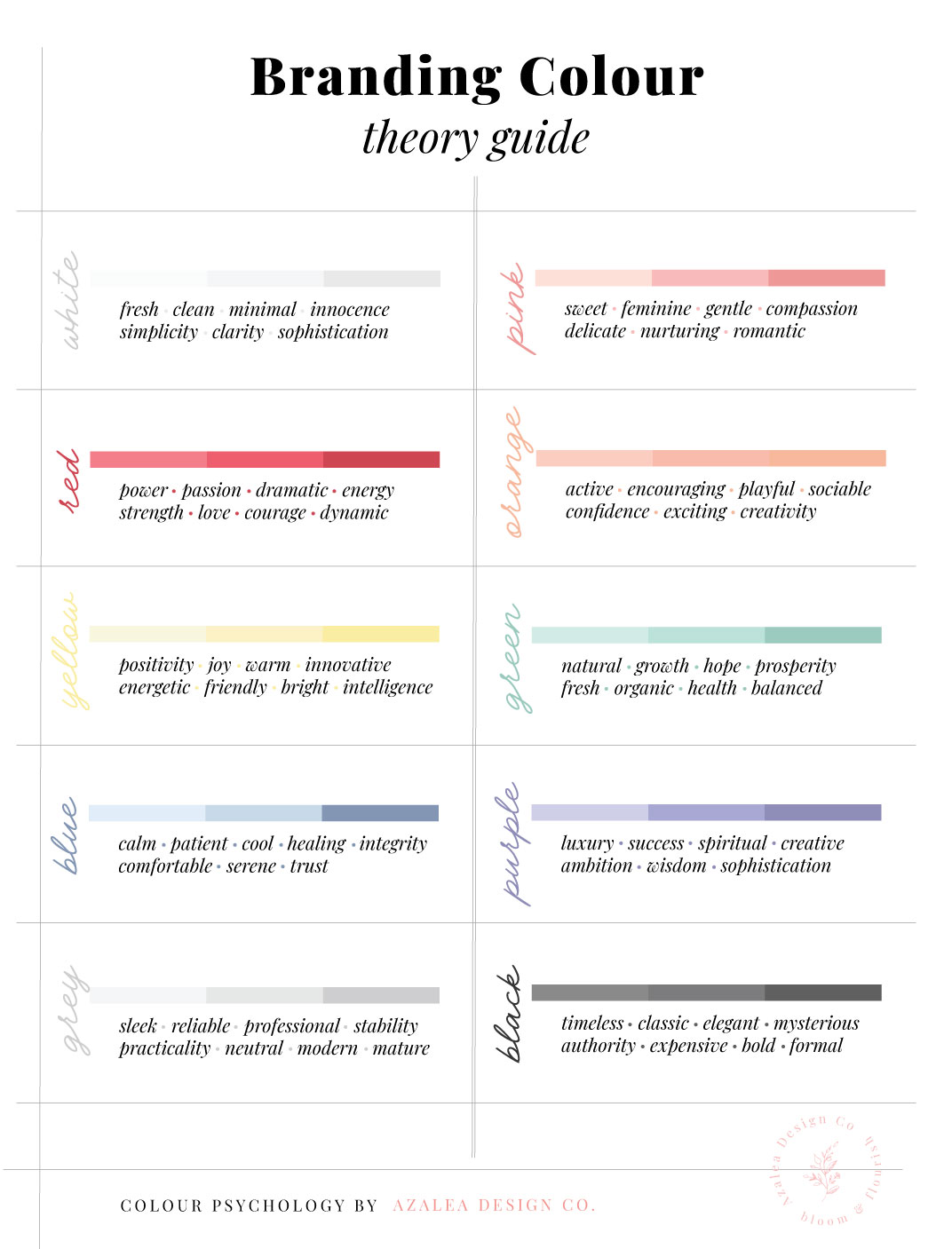
So now that you have those answers I want to let you in on a little colour psychology secret. We have established that colour doesn’t only help reflect your mission, audience & vibe but it also evokes emotion in people. This is so important when connecting to your audience & creating a brand experience. Each colour evokes certain emotions, take a look at the guide below and choose which emotions connect with your brand.
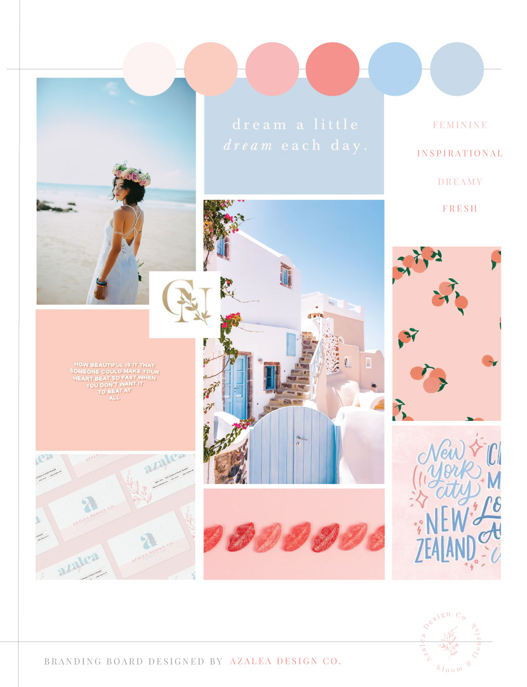
Once you have the list of colours that feel like your brand and you are happy, then the next thing you could do is create a mood board. This just helps put your ideas together and present the colour palette in a nice way. It can also help when designing the branding as it clearly shows your brand vibe. You can also use the images to choose the perfect colour codes.
Here is one I put together for Azalea:
When creating a colour palette, there is a sort of science to it. Let me explain. It is best if you choose to have roughly 5 colours. A great tool you can use for generating colour schemes is coolors.co
1-2 MAIN COLOURS + 2 NEUTRAL COLOURS + 1-2 ACCENT COLOURS
Main Colours:
This could be your boldest colour, but ultimately it’s the colour that best represents your brand. Look back at the colour guide and choose based on emotion. For my brand, my main colours are peach & blue. To me, this represents my feminine & creative designs and the serene and calming approach I have with my clients. Also, to me these colours remind me of a cherry blossom tree in full bloom and my brand mission is to help businesses to bloom. So this felt perfect to me!
Neutral Colours:
Now you need to find a couple of neutral colours that compliment your main colours. These will mostly be used for backgrounds and will help balance the colour palette.
Accent Colours:
The accent colour is a playful and vibrant one. It compliments the rest of the colour palette nicely and is used sparingly throughout your brand. These are used for grabbing your audience’s attention and can be used for Call To Action buttons.
Here are some examples:

At the end of the day, the perfect colour palette for you brand is something that you LOVE and feel connected to. This is just a guide to help you strategise your branding colours and make them work for you.
Keep playing around with this until you find something you love. It may take a while finding the perfect shade of colour, but it’ll be worth it!
If you want some more colour palette ideas, follow our Pinterest Board!
You’ll also love…
-
5 SECRETS TO MAKING YOUR WEBSITE COPY SELL!
-
LESSONS I LEARNT IN MY FIRST YEAR OF BEING AN ENTREPRENEUR
-
The biggest logo design mistake you can’t afford to make
-
Everything you need to know about branding
-
Dreaming of starting a business? Follow these 5 action steps
Leave a ReplyCancel reply
5 secrets to writing website copy that sells
Our top picks
entrepreneur
Get more done & stop procrastinating with calendar blocking
Wellness
Azalea Design Co. – Brand & Website Reveal
design
Lessons I learnt in my first year of being an entrepreneur
The biggest logo design mistake you can’t afford to make
design
MORE
entrepreneur
Dreaming of starting a business? Follow these 5 action steps
Our top picks
entrepreneur
How to stay organised & boost productivity as a business owner
Wellness
Why I chose to move to Showit
design
5 steps to finding your business niche & defining your ideal client
How to prevent & overcome mental burnout as a creative entrepreneur
WELLNESS
BACK
entrepreneur
Join our bloom mail!
Weekly inspiration, resources and support for the fearless woman who's building her empire!
subscribe
let's be insta friends!
© Azalea Design Co. 2024 | All rights reserved | Handcrafted with love and created with Showit
Serving Worldwide
I'm Ashlea and I'm super passionate about helping ambitious women, like you, ditch the 'standard 9-5' to create a life and business of their dreams.
Located in London, UK


